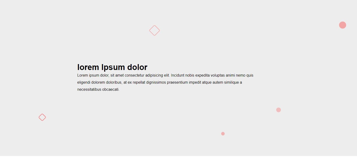
Animating Circle and Square in the background with Mouse Move effect
In this tutorial, we will create some circles and squares with animation and we will also apply the mouse effect using a technique that combines CSS animation with JavaScript to create an interactive visual effect. In this technique, a circular and a square shape are positioned in the background of a webpage, and CSS animations are applied to both shapes to create an animated effect. Additionally, JavaScript is used to detect mouse movement and update the position of the shapes accordingly. As the user moves the mouse left or right, the shapes move some pixels in the same and opposite directions and opposite. This creates an engaging and interactive effect that can enhance the visual appeal of a webpage.
You can use it above any background image or any sections that will look awesome.
First, we will create html structure
                                                    <div class="ath_container" onmousemove="move(event)">
        <div class="circle"></div>
        <div class="circle2"></div>
        <div class="circle3"></div>
        <div class="square"></div>
        <div class="square2"></div>
        <div class="content_col">
            <h2>lorem Ipsum dolor</h2>
            <p>Lorem ipsum dolor, sit amet consectetur adipisicing elit. Incidunt nobis expedita voluptas animi nemo
                quis
                eligendi dolorem doloribus, at ex repellat dignissimos praesentium impedit atque autem similique a
                necessitatibus obcaecati. </p>
        </div>

    </div>
Then, we will write some custom CSS to achieve the target.
                                                    * {
            padding: 0px;
            margin: 0px;
        }

        body {
            font-family: Arial, Helvetica, sans-serif;
        }

        .ath_container {
            position: relative;
            height: 95vh;
            background-color: #ededed;
            display: flex;
            justify-content: center;
            align-items: center;
        }

        .content_col {
            width: 800px;
            max-width: 100%;

        }

        .content_col h2 {
            line-height: 40px;
            font-size: 34px;
        }

        .content_col p {
            line-height: 30px;
        }

        .circle {
            position: absolute;
            top: 30px;
            right: 3%;
            /* transform: translateX(-50%); */
            width: 30px;
            height: 30px;
            border-radius: 50%;
            background-color: rgba(255, 0, 0, .3);
            animation: circleAnimation 10s ease-in-out infinite;
        }

        .circle2 {
            position: absolute;
            bottom: 300px;
            right: 20%;
            transform: translateX(-50%);
            width: 20px;
            height: 20px;
            border-radius: 50%;
            background-color: rgba(255, 0, 0, .2);
            animation: circle2Animation 12s ease-in-out infinite;
        }

        .circle3 {
            position: absolute;
            bottom: 100px;
            right: 35%;
            transform: translateX(-50%);
            width: 15px;
            height: 15px;
            border-radius: 50%;
            background-color: rgba(255, 0, 0, .25);
            animation: circle3Animation 15s ease-in-out infinite;
        }

        .square {
            position: absolute;
            top: 200px;
            left: 45%;
            transform: translateX(-50%) rotate(45deg);
            width: 30px;
            height: 30px;
            border: 2px solid rgba(255, 0, 0, .3);
            border-radius: 5px;
            animation: squareAnimation 8s ease-in-out infinite;
        }

        .square2 {
            position: absolute;
            bottom: 150px;
            left: 15%;
            transform: translateX(-30%) rotate(45deg);
            width: 20px;
            height: 20px;
            border: 2px solid rgba(255, 0, 0, .5);
            border-radius: 5px;
            transform: rotate(90);
            animation: square2Animation 14s ease-in-out infinite;
        }

        @keyframes circleAnimation {
            0% {
                transform: translate(-0%, 2%);
            }

            50% {
                transform: translate(-20%, 100px);
            }

            100% {
                transform: translate(-0%, 2%);
            }
        }

        @keyframes circle2Animation {
            0% {
                transform: translate(-40%, 0);
            }

            50% {
                transform: translate(-40%, 120px);
            }

            100% {
                transform: translate(-40%, 0);
            }
        }

        @keyframes circle3Animation {
            0% {
                transform: translate(-40%, 0);
            }

            50% {
                transform: translate(-40%, 80px);
            }

            100% {
                transform: translate(-40%, 0);
            }
        }

        @keyframes squareAnimation {
            0% {
                transform: translate(-50%, 0) rotate(45deg);
            }

            50% {
                transform: translate(-50%, -100px) rotate(45deg);
            }

            100% {
                transform: translate(-50%, 0) rotate(45deg);
            }
        }

        @keyframes square2Animation {
            0% {
                transform: translate(-30%, 0) rotate(45deg);
            }

            50% {
                transform: translate(-30%, -70px) rotate(45deg);
            }

            100% {
                transform: translate(-30%, 0) rotate(45deg);
            }
        }
Now we will implement the mouse move effect using javascript
                                                    function move(event) {
            var x = event.clientX;
            var y = event.clientY;
            var circle = document.querySelector('.circle');
            var circle2 = document.querySelector('.circle2');
            var circle3 = document.querySelector('.circle3');

            var square = document.querySelector('.square');
            var square2 = document.querySelector('.square2');
            circle.style.right = (3 + (x - window.innerWidth / 2) / 600) + '%';
            circle2.style.right = (20 + (x - window.innerWidth / 2) / 600) + '%';
            circle3.style.right = (35 + (x - window.innerWidth / 2) / 600) + '%';

            square.style.left = (45 + (x - window.innerWidth / 2) / 900) + '%';
            square2.style.left = (15 + (x - window.innerWidth / 2) / 900) + '%';

            // console.log(("w" + (x - window.innerWidth / 2) / 300));
        }